
UI/UX Design Principles
Getting UI/UX design principles wrong costs real money. Users leave a confusing site in seconds. They abandon a checkout flow that feels clunky. They never come back. If you are building anything digital, understanding these principles is not optional. It is the difference between a product people love and one they forget existed.
This guide breaks down the core ideas you need, whether you are a founder sketching your first app, a junior designer prepping for a portfolio review, or a developer who wants to stop guessing what good design means. No jargon walls. Just clear, practical thinking you can use today.

The Quick Answer (If You Are in a Hurry)
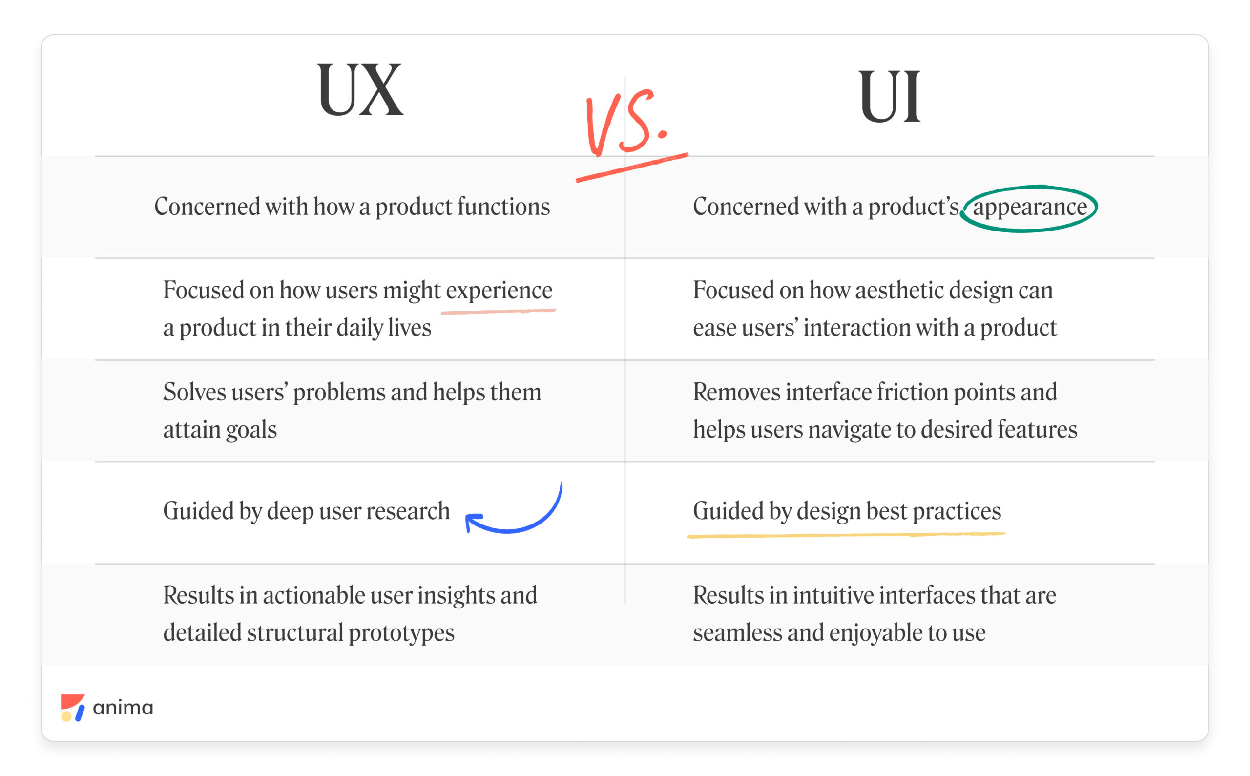
UI/UX design principles are the shared rules that make a digital product easy to understand, pleasant to use, and effective at solving a real problem. UI (user interface) design covers what people see: layout, colour, typography, spacing, and visual order. UX (user experience) design covers what people feel: logical flow, less friction, accessibility, and satisfaction.
They work together. A gorgeous interface that confuses people fails. A perfectly logical flow wrapped in ugly, inconsistent visuals also fails. You need both working at the same time.
Think of it like renovating a kitchen. UI is the cabinet colour, the tile pattern, the brushed-nickel handles. UX is whether the stove sits next to the prep counter, whether the drawers open without hitting the island, whether you can cook dinner without walking in circles. A kitchen can look stunning in a magazine but be miserable to cook in. The best kitchens nail both.
Every principle in this article maps back to one goal: respect the person on the other side of the screen. Their time, their attention, their mental effort. Get that right and most design decisions become obvious.
What Exactly is UI Design?
UI design is the craft of shaping every visual and interactive element a person touches on a screen. Buttons, icons, typefaces, colour palettes, spacing, animations. The UI designer's job is to make the interface communicate clearly at a glance.
Day to day, a UI designer opens a tool like Figma, builds component libraries, checks colour contrast, nudges a button two pixels left because the balance felt off, and hands annotated specs to developers. They care about consistency, visual rhythm, and emotional tone.
Picture a banking app. The UI designer decides that the Transfer Money button is a solid blue pill within thumb reach, that error messages appear in a soft red banner with rounded corners, and that the account balance uses a large, bold number you can read in half a second.
- Visual hierarchy: guiding the eye to what matters first.
- Consistency: the same button style everywhere, no surprises.
- Feedback: every tap produces a visible response.
- Aesthetic tone: the look matches the brand's personality.
What Exactly is UX Design?
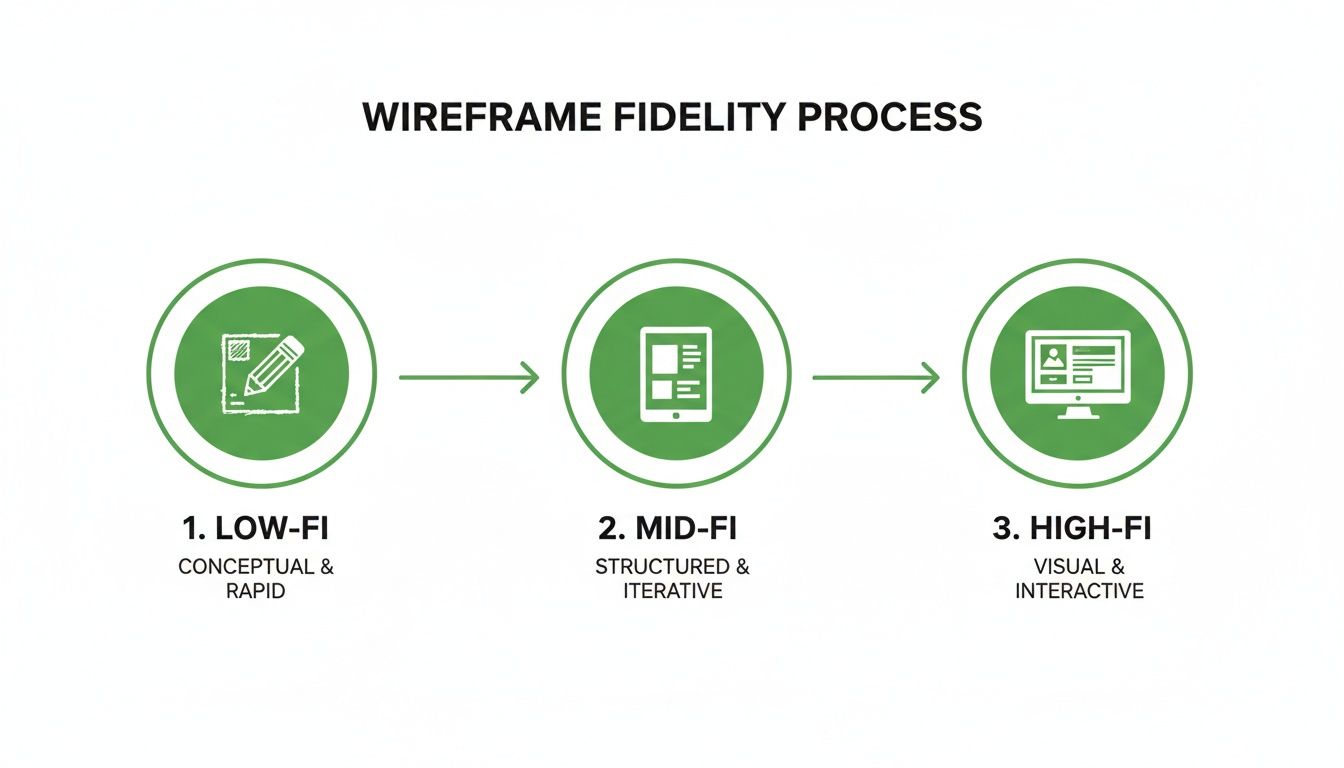
UX design shapes the entire journey a person takes with a product. Research, structure, wireframes, user testing, accessibility checks, and iteration. The UX designer asks "does this solve the user's problem?" before anyone picks a colour.
Day to day, a UX designer interviews real users, maps task flows, builds rough prototypes, watches people struggle through usability tests, then restructures the flow based on what broke. They care about logic, empathy, and measurable outcomes.
Back to that banking app. The UX designer finds that most people want to send money in three taps or fewer. Testing shows users freeze at the field labelled "sort code", so the team adds a hint and an example. They also confirm the flow works with a screen reader.
- User research: decisions grounded in real behaviour, not guesses.
- Information structure: content organised the way users think.
- Task efficiency: fewest steps to reach a goal.
- Accessibility: usable by everyone regardless of ability.
The Core UI/UX Design Principles You Need to Know
These seven UI/UX design principles show up in every serious design system and every usability textbook. Learn them once and you will spot good and bad design everywhere.
1. Clarity Beats Cleverness
If a user has to pause and figure out what a button does, you have lost them. Labels should say exactly what will happen: "Save Draft" not "Commit." Icons need text labels unless they are universally understood. Every screen should answer one question fast: what can I do here?
2. Consistency Builds Trust
Use the same colour for primary actions, the same corner radius on cards, the same error style on every form. When the interface behaves predictably, users relax and stop second-guessing. Inconsistency, even tiny shifts in spacing or tone, makes a product feel unfinished. Design systems exist to enforce this at scale.
3. Feedback Is Non-Negotiable
Every action needs a reaction. Tap a button and it should visibly respond. Submit a form and show success or failure within a second. Load data and display a spinner or skeleton screen. Without feedback, users tap again, get frustrated, or assume the system froze. This is the first rule in Jakob Nielsen's classic usability heuristics.
4. Reduce Mental Effort
Human short-term memory holds only a few items at once. Every extra field, every unnecessary choice, every wall of text taxes that limited buffer. Group related items together. Hide advanced options until someone asks for them. Pick sensible defaults for the common case. Make the easy path the obvious path.
5. Handle Errors Gracefully
People will mistype, tap the wrong thing, and lose their connection. Good design expects this. Inline validation shows exactly which field is wrong and how to fix it. Undo options replace scary confirmation popups. Error messages speak in plain language, never in codes. A well-handled error can actually increase trust.
6. Accessibility Is a Baseline
Colour contrast must meet WCAG minimums (4.5:1 for body text). Interactive elements need visible focus states. Images need descriptive alt text. Videos need captions. Accessible design does not limit creativity. It forces clearer thinking and helps every user, not just those with disabilities.
7. Iterate Based on Evidence
Ship, measure, learn, repeat. Analytics show where users drop off. Session recordings reveal where they rage-click. Simple A/B tests settle design debates with data instead of opinions. No stakeholder's preference outweighs what real users do. Treat every release as a hypothesis to check.
Common Mistakes to Avoid
Theory is useful, but seeing these principles fail in practice is where the lesson sticks. Two scenarios that play out in real product teams every week:
Scenario 1: The Beautiful Dead End
A startup launches a dashboard with a stunning dark-mode interface, custom illustrations, and silky animations. The problem? Onboarding has seven required fields before the user sees any value. No progress bar. No skip option. Most visitors quit halfway through. The UI impressed other designers. The UX drove actual customers away. Pretty does not equal usable.
Scenario 2: The Invisible Wall
An e-commerce team speeds up checkout: three steps, autofill, one-tap pay. Conversion jumps. Then an accessibility audit reveals the payment form has no proper labels, the Place Order button fails contrast checks, and keyboard users cannot reach the pay step at all. A whole group of customers literally cannot buy. The team faces a compliance complaint and rebuilds the component. Fast is meaningless if it excludes people.
Looking Ahead: Where Is This Going?
AI-assisted design tools are collapsing the gap between idea and prototype. Adaptive interfaces now change layout and content for each user in real time. Voice assistants and spatial computing push designers beyond flat rectangles into gesture-driven, three-dimensional interactions. The principles stay the same. The canvas changes.
Accessibility rules are tightening worldwide. Laws like the European Accessibility Act and evolving WCAG guidelines mean "we will add accessibility later" is no longer a safe strategy. Teams that embed inclusive design from the first wireframe ship faster and avoid costly rework.
Design systems are becoming shared infrastructure between design and engineering. Colour tokens, component libraries, and automated visual tests mean UI/UX design principles get enforced in code, not just in a design file. The designer's role is shifting from drawing screens to writing the rules that scale across platforms.
You can already see this shift in client work. Studios now sell websites the way they sell strategy, not decoration. For example, Vinmark's conversion-focused web design service builds every site around mobile-first layouts, clear visual hierarchy, and user flows engineered to turn visitors into customers. That is these principles, applied end to end.
Want to Learn More?
Start with Jakob Nielsen's 10 Usability Heuristics at the Nielsen Norman Group. It remains the most practical checklist for evaluating any interface. Pair it with Google's Material Design 3 documentation to see how a major design system turns UI/UX design principles into reusable components.
For the reasoning behind each rule, the Interaction Design Foundation's design principles library offers structured, expert-reviewed explanations. If accessibility is your focus, bookmark the W3C's WCAG Quick Reference. It is the single most authoritative source for inclusive web requirements.
Wrapping It Up
UI/UX design principles are not a trendy checklist. They are decades of accumulated wisdom about how real humans interact with screens. Clarity, consistency, feedback, low mental effort, graceful errors, accessibility, and evidence-based iteration. Seven ideas. Infinite applications.
Remember the kitchen. You want the tile to look beautiful and you want the stove next to the cutting board. Neither is optional. A product that nails both is the one people return to without thinking and forgive when it has an off day.
So here is your one takeaway: before you style a single pixel, watch one real person try to complete the task your product exists to solve. Everything else flows from that.